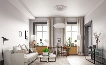

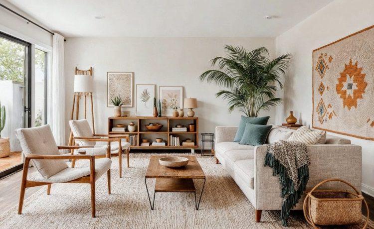
Neutral colors hold a unique position in interior design because they create timeless, flexible, and visually calming environments. Rather than fading into the background, neutrals act as the foundation that allows textures, shapes, lighting, and furnishings to stand out with clarity.
When used thoughtfully, neutral palettes can transform interiors into spaces that feel balanced, elegant, and adaptable to changing trends without frequent redesign.
What Are Neutral Colors in Interior Design?
Neutral colors are shades that work harmoniously with most palettes without dominating visual attention.
Common neutral tones include:
- White
- Beige
- Cream
- Gray
- Taupe
- Soft browns
- Muted earthy tones
These shades provide a versatile base that supports both modern and traditional interior styles.
Why Neutral Colors Never Go Out of Style
Unlike bold color trends that shift quickly, neutral tones remain relevant across decades because they create visual stability and design continuity.
Their lasting appeal comes from:
- Simplicity
- Flexibility
- Compatibility with multiple styles
- Ease of layering textures
- Ability to highlight architectural features
This makes neutral interiors ideal for homeowners seeking longevity in their design choices. 🏡
Neutral Colors Make Spaces Feel Larger and Brighter
One of the most practical advantages of neutral tones is their ability to reflect light effectively.
Light neutrals especially:
- Expand visual space
- Improve natural light distribution
- Reduce visual clutter
- Create openness in compact rooms
For apartments or smaller homes, neutral palettes often produce a noticeably more spacious atmosphere.
They Create a Calm and Comfortable Environment
Color psychology plays an important role in interior design. Neutral shades naturally support relaxation and mental clarity.
These tones help:
- Reduce visual stress
- Encourage focus
- Promote restful environments
- Support everyday comfort
Because of this, neutral palettes are commonly used in living rooms, bedrooms, and workspaces.
Neutral Colors Offer Exceptional Design Flexibility
Neutral backgrounds allow furniture and décor elements to evolve over time without requiring major renovations.
You can easily change:
- Cushion covers
- Rugs
- Curtains
- Artwork
- Accent décor
This flexibility makes neutral interiors both cost-effective and future-ready.
They Highlight Texture Instead of Color
In bold interiors, color dominates attention. In neutral interiors, texture becomes the star.
Combining different materials enhances visual richness, such as:
- Linen fabrics
- Natural wood
- Stone finishes
- Soft wool rugs
- Matte ceramics
- Metal accents
Texture layering keeps neutral spaces from appearing flat or monotonous.
Neutral Palettes Support Every Interior Style
Neutral colors adapt easily to multiple design themes without losing impact.
They work beautifully in:
- Minimalist interiors
- Contemporary homes
- Scandinavian-inspired spaces
- Traditional living areas
- Rustic environments
- Transitional designs
This versatility makes neutral tones one of the most reliable tools in interior styling. 🎨
They Improve Furniture and Artwork Visibility
Neutral backgrounds allow statement pieces to stand out naturally.
For example:
- A bold sofa becomes a focal feature
- Artwork appears more expressive
- Lighting fixtures gain prominence
- Decorative accessories feel intentional
Instead of competing for attention, the room feels visually organized and balanced.
Neutral Colors Help Create Timeless Elegance
Trendy interiors often feel outdated within a few years. Neutral palettes maintain relevance because they rely on balance rather than novelty.
Timeless elegance comes from:
- Soft contrast
- consistent tone layering
- natural material pairing
- restrained color use
This approach keeps interiors refined without appearing overly styled.
How to Prevent Neutral Interiors from Looking Boring
A common misconception is that neutral spaces lack personality. In reality, thoughtful layering makes them visually engaging.
Simple strategies include:
- Mixing warm and cool neutral tones
- Adding textured fabrics
- Using statement lighting fixtures
- Introducing indoor plants
- Incorporating natural wood finishes
These additions create warmth and dimension while preserving simplicity. 🌿
FAQs About Neutral Colors in Interior Design
1. Are neutral colors suitable for family homes with children?
Yes. Neutral backgrounds make it easier to update décor as needs change and allow quick replacement of accent elements.
2. Can neutral interiors work in rooms with limited natural light?
Yes. Warm neutrals like cream and soft beige help brighten darker spaces better than stark white.
3. Do neutral color schemes reduce property resale value risk?
Neutral interiors typically appeal to a wider audience, making them safer choices for long-term property value.
4. Which neutral color works best for walls?
Soft white, warm beige, and light gray are among the most adaptable options for walls.
5. How can I add warmth to a gray neutral palette?
Introduce wooden finishes, warm lighting tones, and layered textiles like rugs or cushions.
6. Are neutral palettes suitable for modern interiors?
Yes. Neutral tones form the backbone of many contemporary and minimalist design styles.
7. Can neutral colors be combined with bold accents successfully?
Absolutely. Neutral foundations make bold accent colors appear more intentional and visually striking.